
It’s Okay Not to Fit In – Why Standing Out Might Be the Truest Thing You Ever Do

It’s Okay Not to Fit In – Why Standing Out Might Be the Truest Thing You Ever Do
For most of my life and maybe for most of yours, I’ve had the unique ability to not fit in, no matter how badly I wanted to.
Take yourself back to 1982, when text messages were called “notes.” They were written with paper and pen, folded with origami-level skill, and hand-delivered across cafeterias and classrooms with super spy precision.
I distinctly remember one junior high lunch, sitting down at a table with a group of girls I knew. They all exchanged notes with each other and began reading them at the table. I ate my lunch in silence, excluded—not because I wasn’t liked, but because I had missed the “Girl Code” memo. I had not written any notes, and I had not received any notes. I was a human space filler for the longest 35 minutes of my life.
My mother shopped for my clothes at Gold Circle and K-Mart and refused to buy the more expensive Izod polos, Jordache jeans, and Nike shoes that screamed “cool.” And while she made me the best-constructed dresses in town, they were more suited for 35–45-year-olds… not the awkward 13-year-old I was.
I could go on and on, but here’s the bottom line: I had no choice but to be different.
The Lessons I Was Taught
And yet, life kept reinforcing a message I tried desperately to absorb:
• Dress “appropriately.”
• Speak “professionally.”
• Market your business like everyone else in your industry.
• Don’t rock the boat.
• Don’t be too much.
• Don’t be too anything.
Be beige.
Be safe.
But here’s the truth I’ve come to embrace:
I was never meant to be beige.
And you probably weren’t either.
I Suck at Beige and Gray
When I launched Wings Hypnosis over a decade ago, I chose a logo that checked every box I was told it should:
• Muted tones—beige, maybe a touch of blue or purple (you know, for “trust”).
• Tasteful. Calming. Respectable.
• Professional. Acceptable. Forgettable.
And I was advised to use my full name as my business name—Traci Kanaan Hypnotherapy. In 50 years, no one’s ever gotten the A’s and N’s in my last name correctly on the first try. I could spend thousands on web domain variations, trying to ensure the not-so-detailed-oriented can find me. Instead, I opted for www.WingsHypnosis.com, because I didn’t want to start this business with a dyslexic advantage.
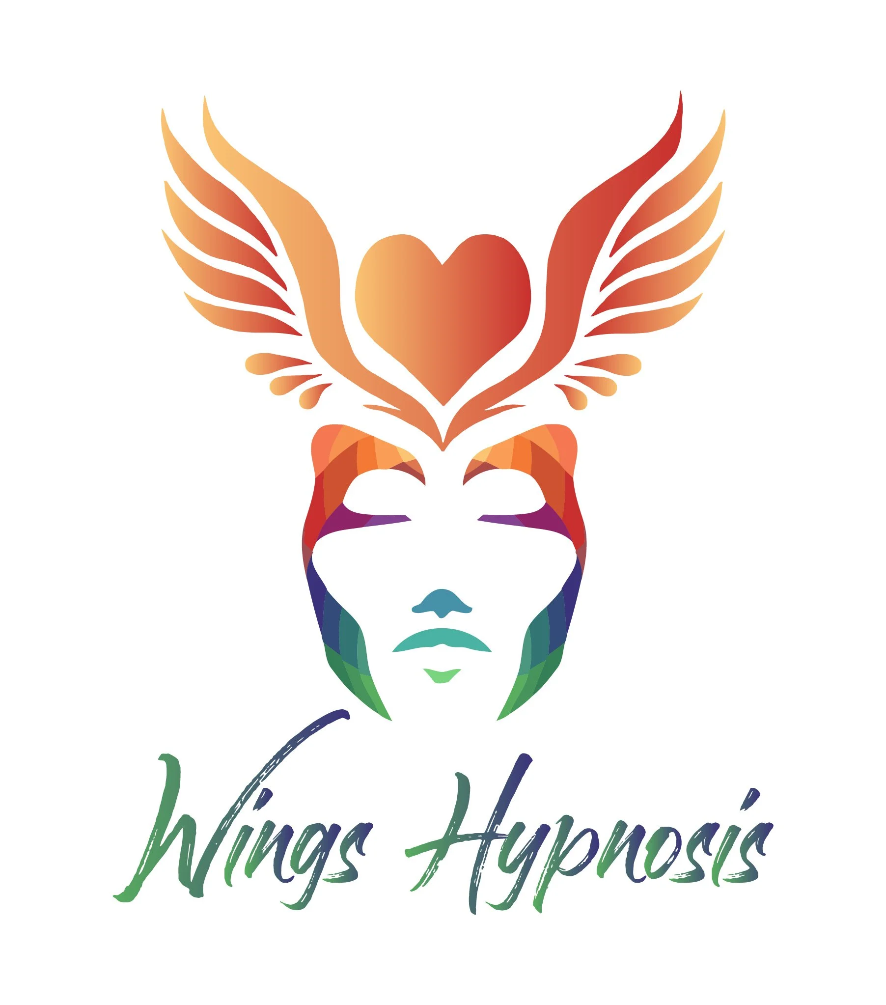
I hired a designer to create my logo and email campaigns… who ended up ghosting me after $5,000 of unfinished work. I liked the logo, sure—but there was always a tinge of resentment attached to it.
Fast forward eight years: My offerings have grown, my confidence has evolved, and my logo just doesn’t fit anymore. I’ve tried to make it work, but every time I looked at it, something felt… off.
I was trying to convey trustworthiness, safety, and healing, but I’d left out something critical:
Joy. Humor. Exuberance. Personality.
The very essence of what makes my sessions unique. The reason clients come back. The reason transformation sticks.
I don’t just help people transform their lives.
I help them lighten up.
So why did my branding look like it had never cracked a smile? Because I was still trying to wear the uniform I thought I had to.
Let’s Be Real: Beige Is Not An Exciting Life Color
Beige might be fine for a waiting room. Or a latte.
But for your life? Your brand? Your soul?
Beige will never hold a candle to full-spectrum authenticity.
I didn’t start this business to be a knockoff version of some hypnotic guru.
I started it to create real, radical, joy-infused transformation—the kind that wakes you up and says:
“We’re all a little broken... and that’s how the light gets in.”
So now? The light is coming through the window like a powerful sunrise after a long night.
I’m rebranding in a way that doesn’t just represent my business—it represents me.
And spoiler alert:
I’m not beige.
I’m colorful. I’m bold. I’m funny AF.
My New Logo Might Shock You
I found a cartoon butterfly that’s bursting with joy and exuberance, and I went, “That’s it.”
• The butterfly represents new beginnings
• The wings represent rising above
• The cartoon represents joy and laughter
Because life transformations don’t have to be heavy.
Because you can get unstuck while laughing.
Because you can take your growth seriously, without taking yourself so seriously.
I’ve Helped Clients:
• Leave toxic relationships with a confident strut
• Laugh their way through anxiety spirals
• Rediscover their “muchness” after decades of playing small
• Rewire old thought loops in one session that felt more like stand-up comedy than therapy
Why?
Because that’s how I work. That’s how I live.
And now, my visual identity is finally catching up to my inner reality.
If your logo, your brand, or your life doesn’t reflect who you actually are…
What are you really building?
A Love Letter to the Misfits, Mavericks, and “Too Much” Souls
This is for the people who’ve been called:
• Too loud
• Too emotional
• Too opinionated
• Too bold
• Too quirky
• Too magical
• Too much
I see you. I am you.
You were taught to water yourself down so you’d be easier to digest.
But the people who truly need you?
They’re thirsty for the real you.
The unfiltered you.
No, you don’t need a new logo to claim your power.
But maybe—just maybe—it’s time to stop editing out the parts of yourself that are dying to shine.
You don’t have to fit into the mold.
You can shatter it—and remake yourself from the pieces.
From Wings to Wonder
As Wings Hypnosis evolves, so do I.
And so do my clients.
If you’re ready to:
✅ Stop trying to be someone you’re not
✅ Finally, embrace what makes you different
✅ Rewire your inner programming to rise above old limitations
✅ And maybe laugh a little while you do it…
Then join me.
New logo. Same heart. Bigger wings.